No products in the cart.

Tailwind CSS is a widely used styling tool in modern web development, but it works differently from traditional CSS frameworks like Bootstrap. Instead of giving developers a set of pre-styled components, it provides utility classes that can be combined directly in markup to build custom interfaces.
Tailwind can speed up front-end development, support more consistent design systems, and fit naturally into frameworks like Next.js. In this guide, we will explain what Tailwind is, how it works, how it compares to other CSS approaches, whether it helps with SEO, and when it makes sense to use.
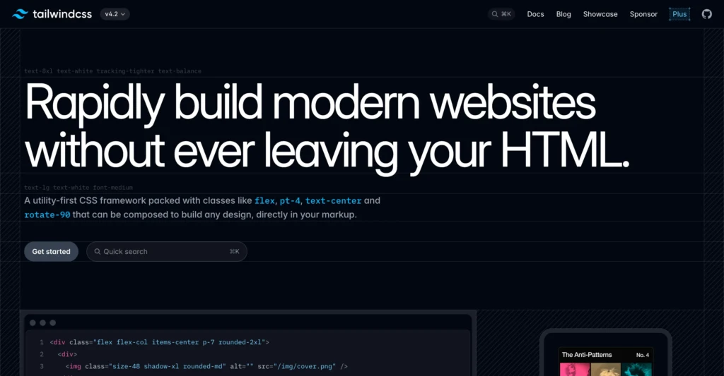
What Is Tailwind?
Tailwind CSS is a utility-first CSS framework. It gives developers small, single-purpose classes they can combine directly in HTML or JSX to control spacing, colors, typography, layout, sizing, and responsive behavior.
Instead of writing custom CSS for every button, section, or card, developers build interfaces by stacking utility classes together. Tailwind does not give you a finished visual theme. It gives you a system for building your own design more quickly and consistently.
How Tailwind Works
Tailwind works by providing a large set of utility classes. Each class does one small job.
One class might add padding. Another might set the text color. Another might control the width. Another might make an element display as flex.
Developers combine those utilities directly in the markup to create a finished component or layout. This is easier to understand with a real example than with a list of abstract class names.
Here is a simple button in a Next.js component:
export default function DemoButton() {
  return (
    <button className="rounded-md bg-blue-600 px-4 py-2 font-medium text-white hover:bg-blue-700">
      Click me
    </button>
  )
}In that one class string:
| Utility class | What it does |
|---|---|
| rounded-md | Adds medium rounded corners |
| bg-blue-600 | Sets the background color |
| px-4 | Adds horizontal padding |
| py-2 | Adds vertical padding |
| font-medium | Sets the font weight |
| text-white | Makes the text white |
| hover:bg-blue-700 | Changes the background on hover |
Instead of creating a custom CSS class like .button-primary, the developer can build the button directly with utilities. That is the core Tailwind approach.
A More Realistic Next.js Example
Tailwind makes more sense when you see it inside a real UI block. Here is a simple card component that could sit on a homepage or landing page in a Next.js app.
type FeatureCardProps = {
  title: string
  description: string
}

export default function FeatureCard({ title, description }: FeatureCardProps) {
  return (
    <div className="rounded-xl border border-slate-200 bg-white p-6 shadow-sm">
      <h3 className="text-lg font-semibold text-slate-900">{title}</h3>
      <p className="mt-2 text-sm leading-6 text-slate-600">{description}</p>
      <a
        href="#"
        className="mt-4 inline-flex items-center text-sm font-medium text-blue-600 hover:text-blue-700"
      >
        Learn more
      </a>
    </div>
  )
}This example shows why Tailwind is popular. The structure and styling stay close together, which makes the component easier to read and adjust while building.
Utility-First Styling and Design Systems
The phrase most associated with Tailwind is utility-first. Instead of relying on large, prebuilt components or long custom stylesheets, developers use small helper classes and combine them directly in the markup.
That can look strange at first, but it becomes easier once the naming system clicks. Tailwind also uses a consistent design scale for spacing, font sizes, colors, breakpoints, border radius, and more. That helps teams and solo developers keep a site visually consistent as it grows.
Tailwind in a Next.js Workflow
Tailwind is especially common in Next.js projects because both tools fit naturally into a component-based workflow. Developers can install Tailwind once, add it to the global stylesheet, and style components directly in the app without creating a large separate CSS layer.
Install Tailwind in a Next.js App
If you are starting from a new Next.js project, the setup is straightforward.
npm install -D tailwindcss @tailwindcss/postcssThen create a postcss.config.mjs file in the project root:
export default {
  plugins: {
    "@tailwindcss/postcss": {},
  },
}In your global stylesheet, import Tailwind:
@import "tailwindcss";After that, you can start using Tailwind classes directly in your app components.
Example Page in the App Router
Here is a simple example of a Next.js page using Tailwind in the App Router.
export default function HomePage() {
  return (
    <main className="mx-auto max-w-5xl px-6 py-16">
      <section className="max-w-2xl">
        <p className="text-sm font-medium text-blue-600">TCB Studio</p>
        <h1 className="mt-4 text-4xl font-bold tracking-tight text-slate-900">
          SEO, web development, and digital systems for modern businesses
        </h1>
        <p className="mt-6 text-lg leading-8 text-slate-600">
          Build a faster, cleaner site and support it with practical content,
          better workflows, and technical decisions that actually make sense.
        </p>
        <div className="mt-8 flex flex-wrap gap-4">
          <a
            href="/services"
            className="rounded-md bg-slate-900 px-5 py-3 text-sm font-medium text-white hover:bg-slate-800"
          >
            View services
          </a>
          <a
            href="/contact"
            className="rounded-md border border-slate-300 px-5 py-3 text-sm font-medium text-slate-700 hover:bg-slate-50"
          >
            Get in touch
          </a>
        </div>
      </section>
    </main>
  )
}This is a good example of Tailwind’s value in a content-focused site or business homepage. Layout, spacing, typography, and button styles are handled directly in the component.
Tailwind also makes responsive design easier to manage.
export default function ThreeColumnGrid() {
  return (
    <section className="grid gap-6 sm:grid-cols-2 lg:grid-cols-3">
      <div className="rounded-lg border p-6">Item one</div>
      <div className="rounded-lg border p-6">Item two</div>
      <div className="rounded-lg border p-6">Item three</div>
    </section>
  )
}In this example:
gridcreates a grid layoutgap-6adds spacing between cardssm:grid-cols-2switches to two columns on small screens and uplg:grid-cols-3switches to three columns on large screens and up
That kind of responsive behavior is one reason Tailwind fits naturally into front-end workflows.
Why Developers Use Tailwind
Tailwind became popular because it solves a few common front-end problems:
Faster UI development
Because the styling utilities already exist, developers can build and adjust components without constantly switching between markup and a separate stylesheet. That often speeds up iteration, especially during design work or client revisions.
More consistent interfaces
Tailwind encourages developers to work from a shared spacing, typography, and color system. That helps websites stay more visually organized over time.
Leaner CSS and easier responsive design
Modern Tailwind builds only include the utilities used in the project, which can help reduce CSS bloat. Tailwind also includes responsive prefixes that make it easier to adjust layouts across screen sizes without writing every media query from scratch.
Tailwind vs Traditional CSS
To understand Tailwind clearly, it helps to compare it with traditional CSS.
In a standard workflow, a developer writes HTML or JSX, creates a named class, and defines the styles in a separate stylesheet. Tailwind shifts that process by applying styling directly in the markup with utility classes.
Here is the same button built both ways.
Traditional CSS Example
<button class="primary-button">Contact us</button>.primary-button {
background-color: #2563eb;
color: white;
padding: 0.5rem 1rem;
border-radius: 0.375rem;
font-weight: 500;
}
.primary-button:hover {
background-color: #1d4ed8;
}
Tailwind Example
<button className="rounded-md bg-blue-600 px-4 py-2 font-medium text-white hover:bg-blue-700">
  Contact us
</button>Here is the practical difference:
| Approach | Typical workflow | Main tradeoff |
|---|---|---|
| Traditional CSS | Write HTML or JSX, then write CSS selectors in a stylesheet | More separation, but often more overhead |
| Tailwind | Apply utility classes directly in markup | Faster styling, but markup becomes more class-heavy |
Neither approach is right for every situation. Tailwind is popular because many developers find the speed and control worth the tradeoff.
Tailwind vs Bootstrap
A very common question is how Tailwind compares to Bootstrap.
Bootstrap is a component-based CSS framework. It provides developers with a library of pre-styled components, such as buttons, navbars, cards, and modals. That can be helpful for getting a site up quickly with minimal design decisions.
Tailwind works differently. It does not start with finished components. It provides developers with low-level utilities they can use to build their own components.
Here is a simple comparison:
| Tailwind | Bootstrap |
|---|---|
| Utility-first | Component-first |
| More design freedom | Faster out-of-the-box components |
| Less default visual identity | Stronger default visual patterns |
| Better for highly custom designs | Better for quick standard layouts |
| Common in modern app workflows | Common in traditional business and admin interfaces |
Bootstrap is often easier for beginners who want something ready-made. Tailwind is often better for developers who want more control without writing large amounts of custom CSS.
Which One Is Better?
Neither Tailwind nor Bootstrap is better in every situation.
Bootstrap can be a good fit when a project needs ready-made components and design flexibility is not the top priority.
Tailwind is often a better fit when the goal is a more custom interface, especially in React, Vue, or Next.js projects where component-based development is already built into the workflow.
For many modern marketing sites, product sites, and custom business websites, Tailwind is often the more flexible option.
Is Tailwind Good for SEO?
Tailwind does not improve rankings on its own. Search engines don’t reward a site simply for using Tailwind instead of another CSS framework.
What Tailwind can do is provide a better technical foundation when used well. Because modern Tailwind builds exclude unused utilities, the final CSS can stay leaner, which may help performance and user experience. Tailwind also makes it easier to build clean, responsive layouts that support readability and mobile usability.
That said, Tailwind does not replace SEO strategy. It does not handle keyword research, content quality, internal linking, metadata, structured data, or technical SEO work. It is a front-end tool, not an SEO plan.
When Tailwind Makes Sense
Tailwind can be a strong choice for small businesses when building a site with a custom front end. The real question is not whether a business needs Tailwind specifically. It is whether the development approach leads to a faster, easier-to-maintain, and more flexible website.
Tailwind usually makes sense when a project needs a custom design, a modern front-end workflow, and a consistent system for layout, spacing, and typography. It is especially useful for marketing websites, SaaS interfaces, startup landing pages, resource libraries, custom business sites, and internal dashboards.
It may be unnecessary for very small websites, projects already covered by a strong prebuilt theme, or teams that work faster with traditional CSS or component-heavy frameworks like Bootstrap. The right choice depends on fit, not hype.
The Tailwind Learning Curve
Tailwind is approachable, but it still has a learning curve. New users need time to get comfortable with utility naming, spacing scales, responsive prefixes, and state modifiers like hover and focus.
At first, the class strings can look noisy. After some repetition, they usually become easier to read because the naming is consistent.
Final Thoughts
Tailwind changes how modern websites get styled. Instead of relying on large, custom stylesheets or heavily prebuilt UI frameworks, it provides developers with a faster, more structured way to build custom interfaces.
For small businesses, creators, and independent teams, the important takeaway is simple. Tailwind is useful when it helps produce a faster site, a cleaner design system, and an easier-to-maintain workflow over time.